WHY MOST PRODUCT PAGES DON’T CONVERT
Many ecommerce stores—whether on Shopify or WooCommerce—struggle with the same issue: traffic is there, but sales are not.
This usually happens because:
- The value proposition is unclear
- Product description writing is weak
- No strong trust signals or social proof
- Page speed is slow
- Layout creates friction
Users don’t spend time figuring things out. If your page doesn’t answer questions instantly, they leave.
CORE ELEMENTS THAT MAKE A PRODUCT PAGE SELL
1. CLEAR VALUE PROPOSITION
Within seconds, users should understand:
- What the product does
- Who it’s for
- Why it’s better than alternatives
Clarity increases trust and reduces hesitation.
2. VISUAL HIERARCHY & PRODUCT IMAGES
Images are not decoration—they are decision drivers.
A high-converting product page includes:
- 4–6 high-quality images
- Lifestyle and real-use visuals
- Zoom and close-up details
This helps users imagine owning the product, which increases conversion rate.
3. BENEFIT-DRIVEN PRODUCT COPY
Features inform, but benefits sell.
Instead of listing specs, explain outcomes:
- How it solves a problem
- What life looks like after using it
This approach aligns with real buying psychology.
4. SOCIAL PROOF & TRUST SIGNALS
People trust other buyers more than brands.
Effective product pages include:
- Customer reviews and ratings
- Testimonials or user-generated content
- Secure checkout icons and guarantees
For global audiences, especially in the USA and UK, trust is a major conversion factor.
5. STRONG CALL-TO-ACTION (CTA)
Your CTA should be impossible to miss.
Best practices:
- Use clear text (“Buy Now”, “Add to Cart”)
- Place it above the fold
- Use contrasting colors
CTA optimization directly impacts how many users take action.
STEP-BY-STEP FRAMEWORK TO INCREASE PRODUCT PAGE CONVERSION
- CAPTURE ATTENTION
Use a strong headline and hero image - BUILD INTEREST
Highlight key benefits with visuals - CREATE DESIRE
Add social proof and emotional triggers - REMOVE OBJECTIONS
Include FAQs, guarantees, and policies - DRIVE ACTION
Use urgency (“Limited stock”) and a strong CTA
This mirrors how users move through a sales funnel in real scenarios.
GOOD VS BAD PRODUCT PAGE
| Element | High-Converting Page | Low-Converting Page |
| Copy | Benefit-focused | Feature-heavy |
| Images | Multiple & lifestyle | Limited |
| Trust | Reviews + badges | None |
| UX | Fast & clean | Cluttered |
| CTA | Clear & visible | Hidden |
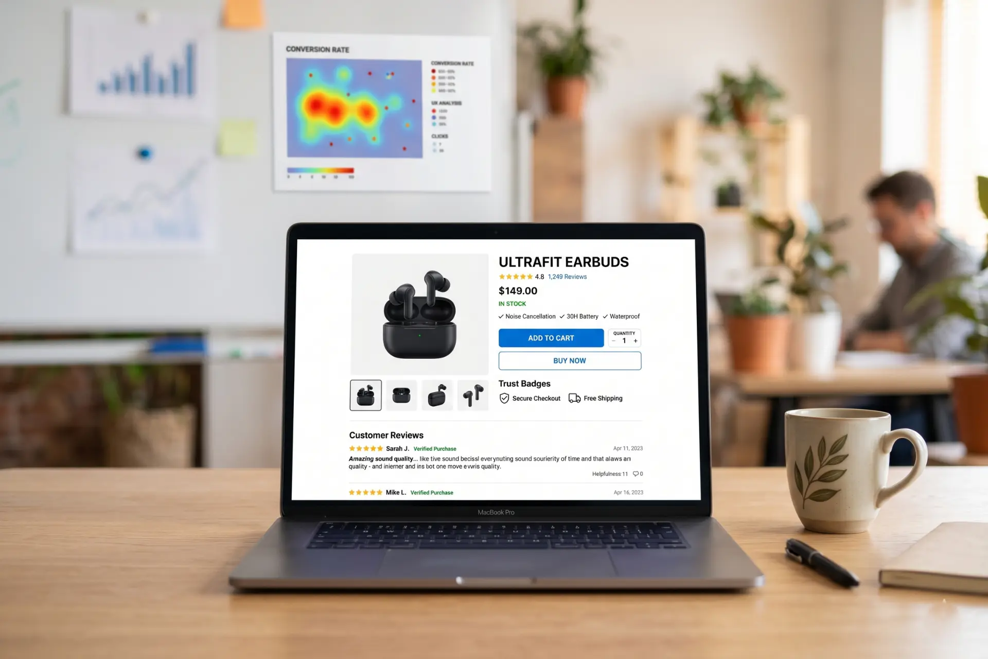
TOOLS THAT HELP OPTIMIZE PRODUCT PAGES
To improve performance, use:
- Google Analytics for behavior tracking
- Hotjar for heatmaps and user insights
- Microsoft Clarity for session recordings
- A/B testing tools to compare layouts and CTAs
These tools help identify friction in your funnel optimization and improve results over time.
PRICING & GLOBAL CONSIDERATIONS
If you’re targeting international buyers:
- Display prices in USD or GBP
- Offer transparent shipping and return policies
- Simplify the checkout process
Professional CRO services typically cost between $300 to $5000+, depending on the complexity and scope.
COMMON MISTAKES THAT KILL SALES
- Overloading the page with text
- Ignoring mobile UX
- Hiding important information
- Slow loading speed
- No emotional connection
- Lack of urgency or trust signals
Even small mistakes can reduce conversions significantly.
CONCLUSION
A product page sells when it feels clear, trustworthy, and effortless to use. It combines strong visuals, persuasive copy, and proven CRO principles to guide users from interest to action.
If your page answers questions instantly, removes friction, and builds confidence, it won’t just attract visitors—it will convert them into buyers consistently.
No Comments